If you can't put your finger on why your interface feels wrong, you've probably failed to express the right tone of voice

Mar 19, 2020
Ever designed an interface that has all the right pieces but something just doesn't feel right? The copy is well written. The interface elements are thoughtfully designed. The user actions are clear.
Yet it doesn't sit well with you. It doesn't feel right. But you can't put your finger on why. Moving elements around the page doesn't fix it. Changing the button colour doesn't fix it.
What have you missed?
Copywriters often talk about tone of voice. How your chosen words reflect the personality of the content and the company your speaking for.
Your message is what you’re trying to communicate. Your tone of voice is how you communicate it – Joanna Wiebe
Writers use the tone of voice as a method of reasoning for decisions they make around word choice and grammar. The tone of voice gives your written materials a unified character. It makes it feel like it's coming from one source. One voice of truth. A cohesive voice.
Designers are also responsible for the tone
It's not just writers that should be thinking in terms of tone of voice. Designers are also responsible for the tone. Each element of your design speaks with a voice. It has a mood. Your design should present the intended mood or the messaging and design will be at odds.
As a designer, you have the power to affect the emotion of your product. You can reinforce it, subdue it, contradict it or attempt to be neutral. All strategies can be valid depending on the purpose of each element and the context for the interface.
I write about this topic as it pertains to interface design, but it's equally relevant to other areas of design.
The process of designing with the tone in mind
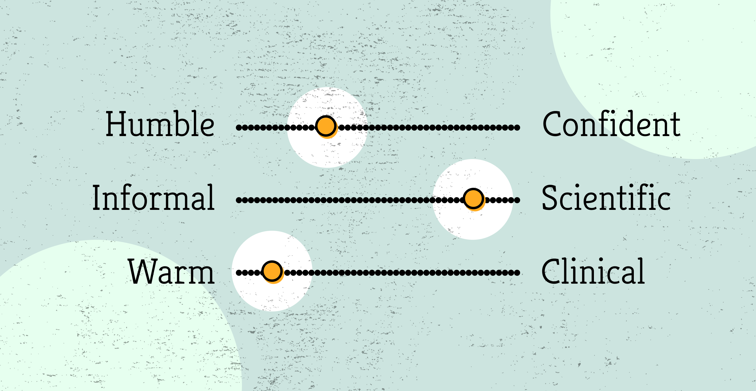
- Define the tone: The easiest way to think about the tone of voice is as the personality of the brand. If it was a person, what kind of person would they be? Are they honest, innovative, traditional, practical, knowledgable, forward-thinking, energetic? The tone of voice for a meditation iPhone app may want to be calm, knowledgeable and honest. Whereas the tone of voice for a music festival's website might be fun, individualistic and wacky.
- Read the copy: The first step in designing with tone in mind is to read the words in the interface. Define the personality of those words. Understand the words as if you were having a conversation with the person that's speaking them.
- Consider the context: **The context needs consideration for the tone of voice. Graphics for social media can be fun and whimsical. The design of the support docs for your product should most likely be more serious and straightforward.
- Create a shared source of truth: More on this below.
Create a shared source of truth
Designers traditionally created mood boards to establish a tone of voice.
A mood board is a type of visual presentation or a collage consisting of images, text, and samples of objects in a composition. It can be based upon a set topic or can be any material chosen at random. A mood board can be used to convey a general idea or feeling about a particular topic – Wikipedia
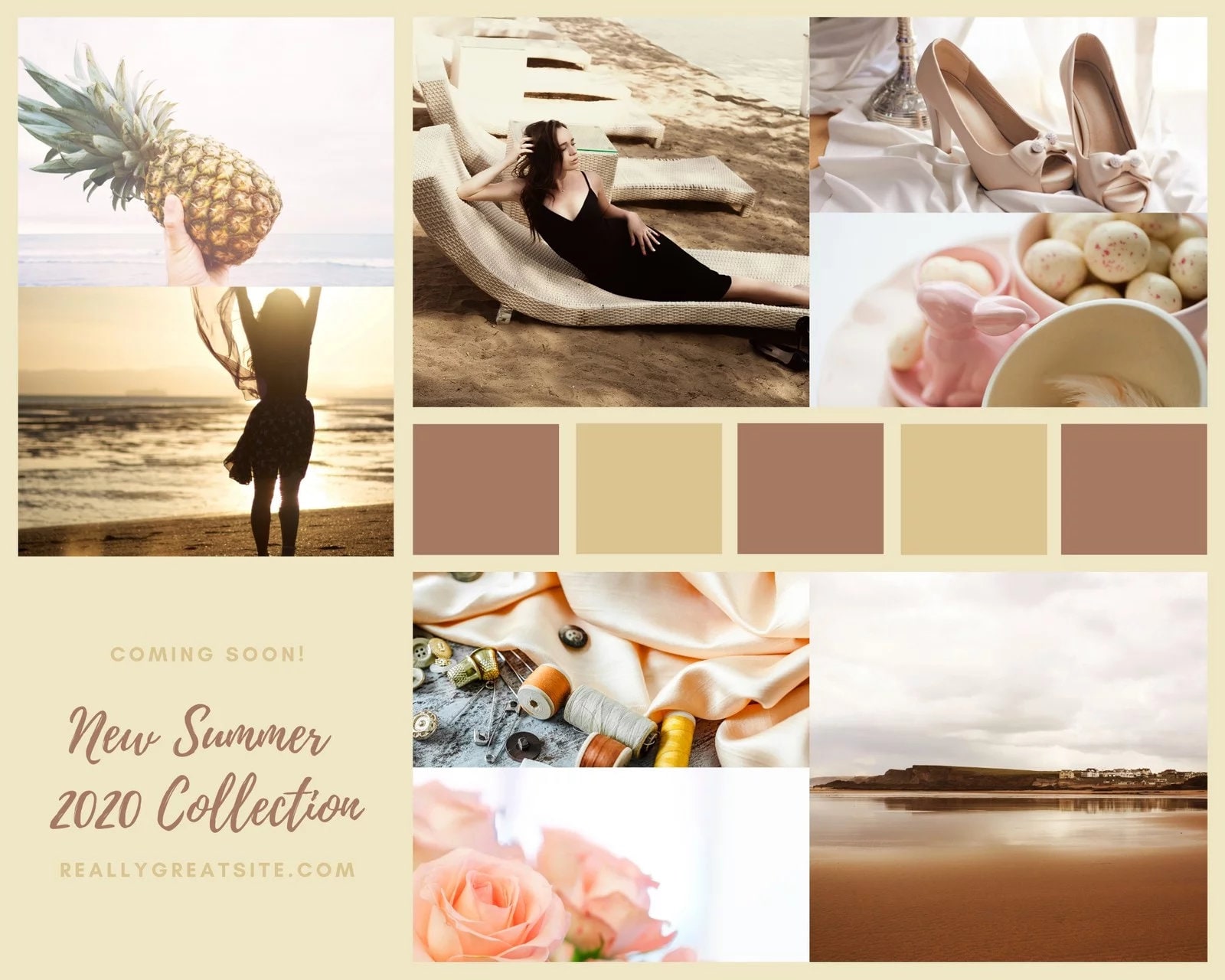
Mood boards usually focus on imagery. They are useful for graphic designers, interior designers, and wedding planners, but have limited utility for product designers.
Product designers need to take interface elements into account as well as imagery. Samantha Warren identified and addressed this need years ago when she created style tiles.
Style Tiles are a design deliverable consisting of fonts, colors and interface elements that communicate the essence of a visual brand for the web – Samantha Warren
Samantha recommends using style tiles when a mood board is too vague and a mockup is too precise. Style tiles fall right in the sweet spot between those two items.
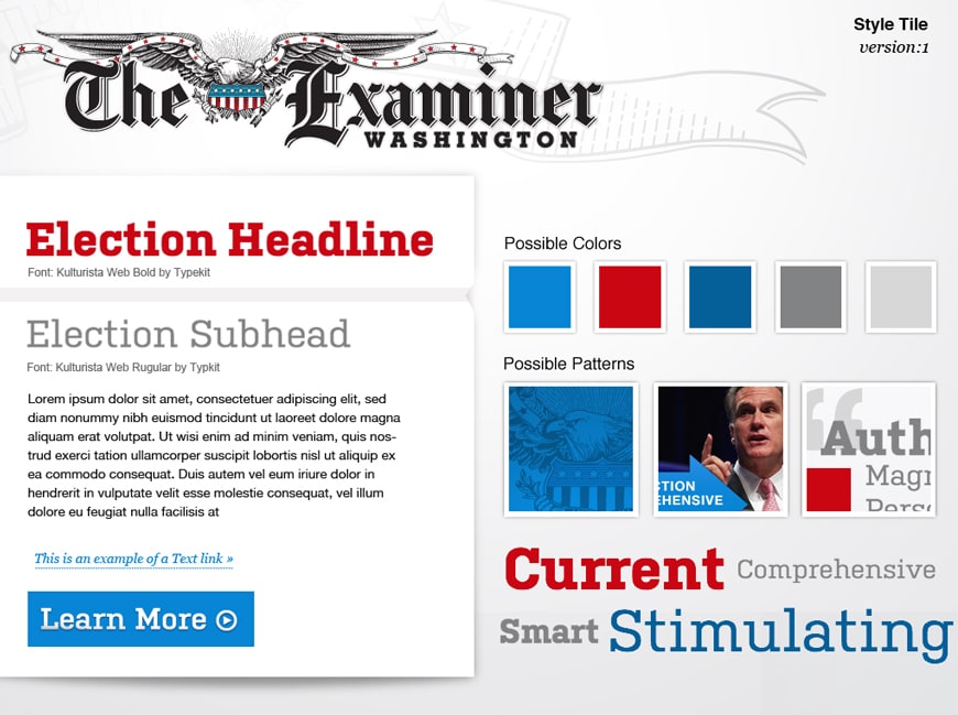
A style tile is a perfect deliverable for establishing the source of truth for the tone of the piece.
You should always be aware of the tone you are conveying, but that tone shouldn't always be the same as your brand or product. There are additional considerations…
When to reinforce the tone of voice
Reinforce the tone of voice when you're trying to inspire. To engage. To bring someone along for the ride emotionally.
Marketing materials: Design of marketing materials should generally match the tone of the words and the brand.
Social media: This may the chance to be a more casual version of your regular brand tone. Again, context matters – if you're tweeting about unscheduled downtime, don't include a meme in your post. Your followers may be pissed off already, don't fan the flames.
Successful moments: Your use has just reached a milestone in using your product. This is a chance to congratulate them on the tone of your brand. Designers often talk about "delight". Successful moments are a great time to elicit delight through verbiage, design, and animation.
When to be neutral
Sometimes as a designer you need to be a helpful, unbiased guide. You're not trying to persuade, you're there to help navigate or complete a task.
Have you ever run late for a flight at the airport? You'll quickly understand the importance of clear and functional airport signage. This is not a context for conveying the tone of voice in written or visual terms. It's time to be direct. People are scanning for information so they can take action.
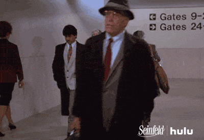
Where the heck is my gate?! Get out of my way!
As product designers, much of our work revolves around guiding users to their destinations. Making them feel at ease. Facilitating the right action at the right time in the way the user expects. This is when you want your product to be an unbiased guide.
Navigation should be boring. Unbiased. Bland. Never impart brand voice in a navigational system. This applies to the words you choose, but also the design.
Interactive elements such as tabs and buttons should be functional-first. Don't make your buttons look innovative because that's the tone of your brand. Buttons should be obvious, accessible, and behave like buttons.
How to express the appropriate tone of voice in your interfaces
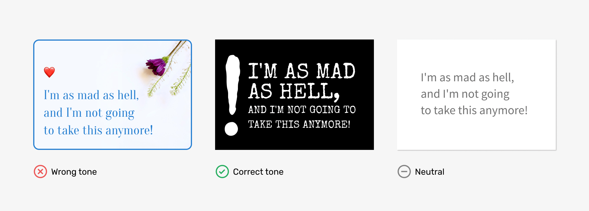
Above is a contrived example of three ways to style the same quote. This person is angry. They are fed up. You as a designer have the power to affect the interface's emotion.
Colour and icons
Traffic light colours are internationally understood. Green signifies success or a way to proceed. Orange is used to get someone's attention to an important message. Red for errors or deleting items. Designers capitalize on these colours as an effective means of conveying tone.
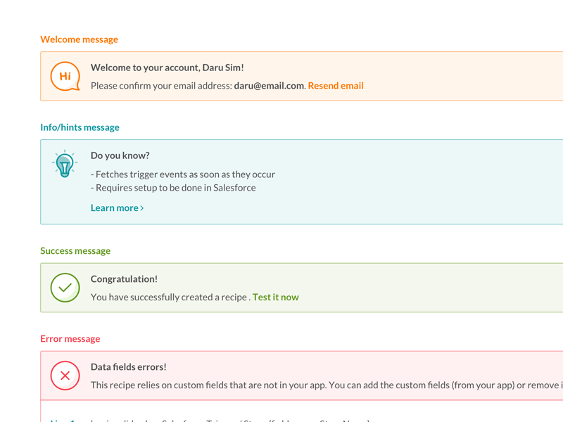
Notification messages are a time when designers attempt to reflect the tone with their design. The example below from Daru Sim uses icons and colours to reinforce the tone of each message.
Typography
- Weight: Bold text packs a punch. Light weights speak with sophistication.
- Size: Huge text screams. Tiny text whispers. Normal-sized text focuses on the message.
- Spacing: Tight spacing increases information density, which may impart seriousness. Loose spacing may give a sense of luxury.
Animation
Animation in UI design is mostly used to help communicate a change the user has affected. Designers refer to these events as state changes.
- Bouncy animations are fun and lighthearted.
- Fast animations are purposeful, and signal state changes with less personality than bouncy ones.
- A lack of animation can feel utilitarian.
Shape
- Curved, organic shapes are friendly. Think smoothy brand.
- Sharp angles and straight lines are decisive. Think mining company.
Layout
The overall layout of an interface can even convey tone.
- Chaotic layouts are adventurous. A Pinterest board is perfect for browsing and being inspired. It's exploratory and discovery-based.
- Structured layouts are utilitarian and unbiased. An insurance comparison site presented in a table attempts to present the data in an unbiased manner.
How to test the tone with users
Just like other aspects of the design process, testing with real users will validate your assumptions about the tone you are conveying.
Show users the style tiles or mood boards you've created. Ask them to speak their thoughts out loud to uncover their perception of the piece's personality.
- What do you feel when you see this?
- Could you describe how you feel while using it?
- What was your overall impression?
If you understand how a user reacts emotionally to what's presented, it will help you understand the tone you are conveying.
Takeaways
- Designers can choose to reinforce tone, subdue it, contradict it or attempt to be unbiased.
- Reinforce the tone of voice when you're trying to inspire. To engage. To bring someone along for the ride emotionally.
- Be unbiased when you are acting as a guide. You're not trying to persuade, you're there to help navigate or complete a task.